
hello there! ☼
It’s been a while since I’ve shared a peek into my art journal. Today features the debut of my current journal on the blog. It’s especially dear to my heart since I stitched it together myself.
Isn’t the olive green gorgeous? And the gold embossing adds charm and a vintage flair to the whole thing.

Ars gratia artis means “art for the sake of art” in Latin. I thought it to be an appropriate start to an art journal.

Featuring tracing paper, parchment paper, tissue paper, and more paper!
And yet, more paper!

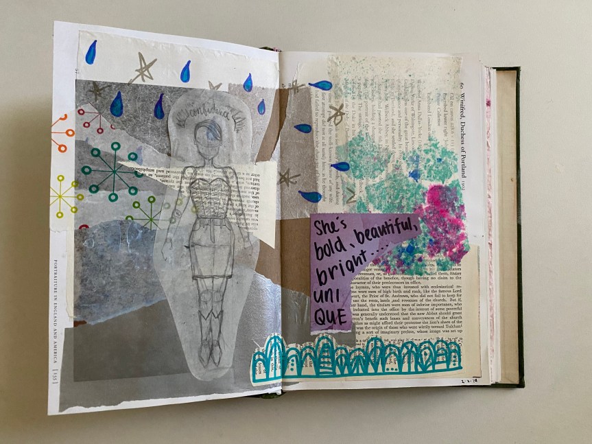
The left features a very old newspaper and the right a picture from a more recent magazine.

The lovely lady on the left comes from a book of John Singer Sargent’s paintings. Her old-fashioned, yet charming demeanor melds with the eclectic blue background. Both backgrounds were created with a paint brayer.

I love collecting paper, especially those from unusual sources. It adds such character and dynamic to any art spread.

On the left, I used moved around acrylic paint and alcohol ink with a heat tool to create a paint splatter effect. The right features a transparent insert made of tracing paper.


I decided to try a different, more minimal approach here with only a black paint marker as my writing utensil.


I love the image of this warrior woman with the beautiful script.

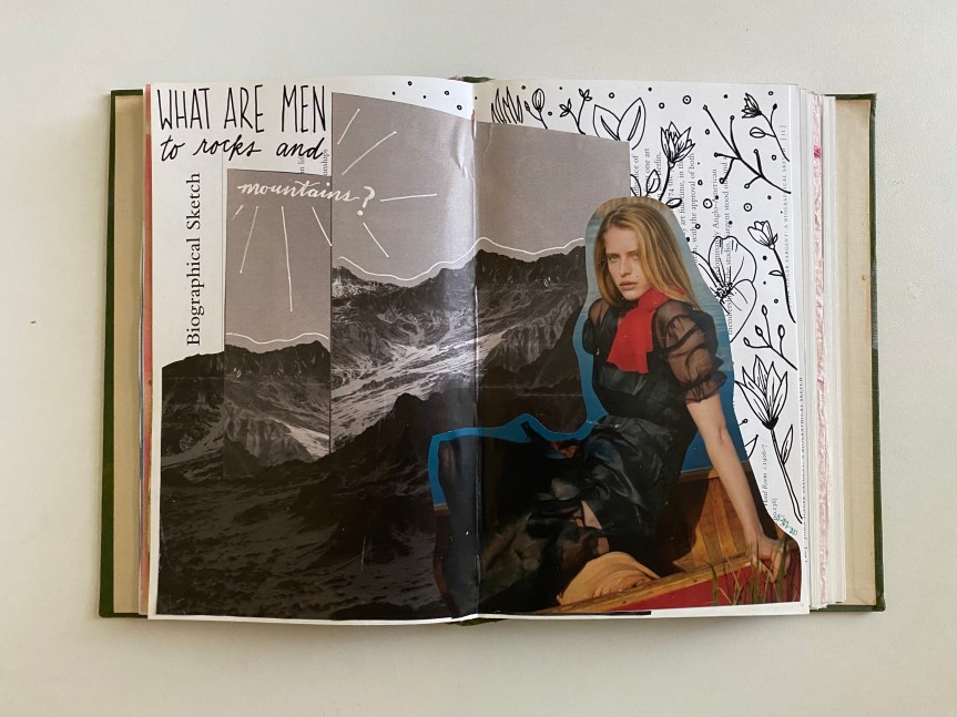
This quote, by Jane Austen, was recommended to me by a friend. I drew florals on the left side with a black paint marker to provide a softer contrast to the harsh nature of the mountains.
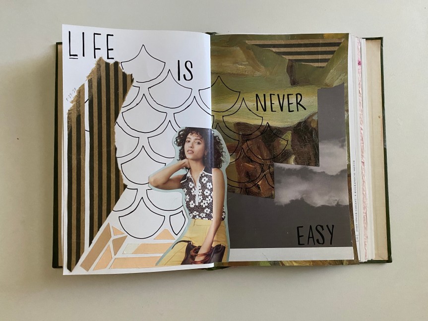
I used a stencil I made the create the understated background of scales. Together with the striped kraft paper and the clouds and the paint swashes, it represents a whole range of textures.
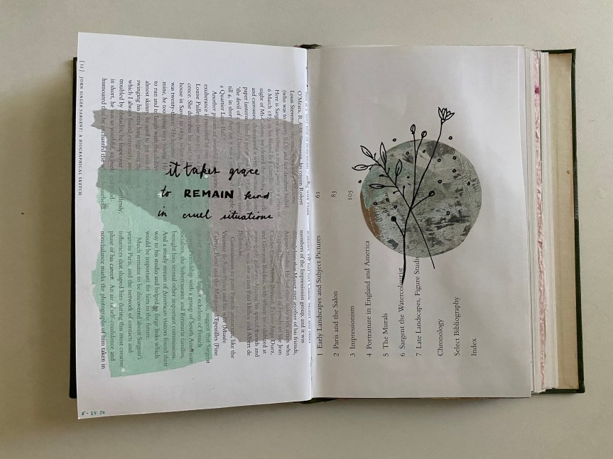
Equally as minimal as a few previous ones, this takes a step into a softer aesthetic. I love the calmness of the piece.
I truly enjoyed creating these spreads. There is something cathartic about creating art and using it to represent parts of one’s life.
☼
I’d love to hear from you! Do you art journal? What was your favorite spread? Leave me a note in the comments!


These are so pretty! I love the collage style of your art.
LikeLiked by 1 person
Thank you, Lanie! ❤
LikeLike
Oh my goodness how amazing!! I’ve never seen art doen this way before, but I love it. Thank you for sharing!
LikeLiked by 1 person
Thank you for the kind words, Kendra! I’m glad you love it!!
LikeLiked by 1 person
These are absolutely gorgeous and so aesthetic! ❤
LikeLiked by 1 person
aww thanks! I’m glad you like them.
LikeLike
ooh, I love all the different textures and mediums, and all the ladies and drawings. So awesome, Gaby!
LikeLiked by 1 person
Thanks, Audrey!!
LikeLiked by 1 person
Ahhh! These are all so beautiful😄
LikeLiked by 1 person
❤
LikeLiked by 1 person
This looks beautiful!!
LikeLiked by 2 people
thank you!
LikeLiked by 1 person
oh. my. goodness.
Gaby. 😍
THIS IS SO BEAUTIFUL ALSJDLOVOCNWK
I do not art journal. But now I really want to.
👏🏼👏🏼👏🏼
LikeLiked by 1 person
AWWE thanksss Maggie! I’m glad to have inspired you ❤
LikeLiked by 1 person